
I will not work with anything generated by AI
〰️
I will not work with anything generated by AI 〰️
I will look over your document and provide you with a personalized quote for free. If you choose to hire me, half the quote is due up front, and the remainder (including any extra expenses incurred) will be due upon delivery. Email me at qmartin@quinnsilver.com to request services.
Editing Services
I offer proofreading, copy editing and developmental editing at competitive rates. I primarily edit games, but will also edit prose. If your work doesn’t already have a style guide, I will generate one at no extra cost. I prefer to work in google docs, but will work with whatever format you have.
-
I will check for spelling and grammar errors (American English), and adherence to your style guide. $20 minimum. No discount for additional passes.
-
I will edit for clarity, consistency, and cohesion, and for adherence to your style guide. If I think something needs a sensitivity reader, I will flag it. $30 minimum. Additional passes at 3 cents/word.
-
I will review your rule set, game structure, and other technical aspects of the game, and suggest heavy changes. $75 minimum. Additional passes at 6 cents/word.
What I need from you:
Your game’s overall mood/tone (including cultural touchstones).
Your style guide, if you have one.
The game’s intended audience (new players vs veterans, age range, etc).
Your cultural background.
You core design principles.
Other information you feel is relevant, if applicable.
Layout Services
Layouts are done in Affinity Publisher 2 and exported to PDF. If you provide assets, it is your responsibility to ensure that they are in compliance with the copyright laws of your country. All layouts include 1 round of revisions, if they are needed. Additional revisions after the 1st one go for half the rate.
-
This assumes you have all the assets (fonts, art, etc.) prepared, and also know roughly how you want them to appear in the final book.
-
You have art but don’t know where you want most of pieces appear, and don’t have final presentation details in mind, such as decorative borders or fonts. I will choose fonts and decorative assets that compliment your game, and place art appropriately. All assets I provide will be licensed for commercial use in the USA.
-
I will do all the visual design elements of layout in the tier above, and also seek out art for some or all of your game from public domain sources. If you want me to purchase stock sources, the cost of the license will be passed on to you.
What I need from you:
Your game’s overall mood/tone (including cultural touchstones).
The game’s intended audience (new players vs veterans, age range, etc).
You core design principles.
Your final format requirements including printer specifications, if applicable. If you’re publishing through DTRPG, I only need the final size, as I already have the color specifications for their print on demand service.
Editing Portfolio
Impulse Manifold
By KindDunaad
Chimera
By Adam Chan and Envy Wright
Layout Portfolio
Black Friday
Black Friday is a satirical PBtA game about doing your Christmas shopping. The game is set in the mid 2000s, and I really wanted the design to capture the nostalgia of that era. The entire book is designed to look like a print-out from a web page from that era, and the character sheets are based on MySpace profile designs.
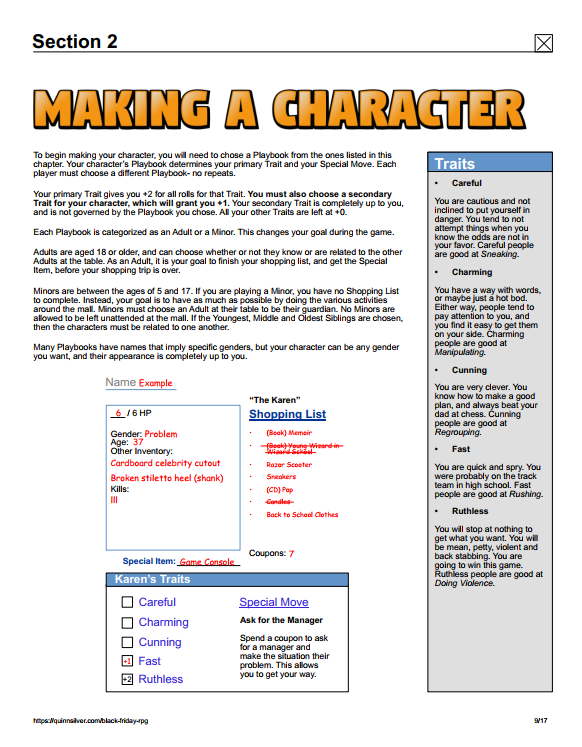
Core Design Elements include: Web 2.0 bubble font, sans-serif system font for the main text, purple and blue “link” texts, and imperfect alignment. I also chose to have a menu side bar displaying certain pieces of game information, to really capture the feeling of looking at a web site from that era.
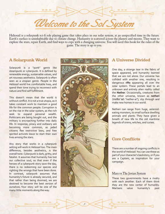
Heliosail
Heliosail is a solarpunk pirate game that takes visual influences from the art nouveau movement at the turn of the 20th century, the “golden age of piracy” in the 1700s, and a little bit of 60s pulp sci-fi. I chose to emulate common printing habits of the time, such as two-to-three columns, pictures in the center framed by
decorative borders. To bring the science fiction elements in, I chose a sans-serif font for the body text, used fewer decorative borders and made them geometric. I also chose a font that I thought looked a little blocky and “futuristic” - but that was actually invented in the era I was referencing. Finally, I chose to use a detached cursive font as the title font, which I thought captured the spirit of the 1700s while still being a little more modern.